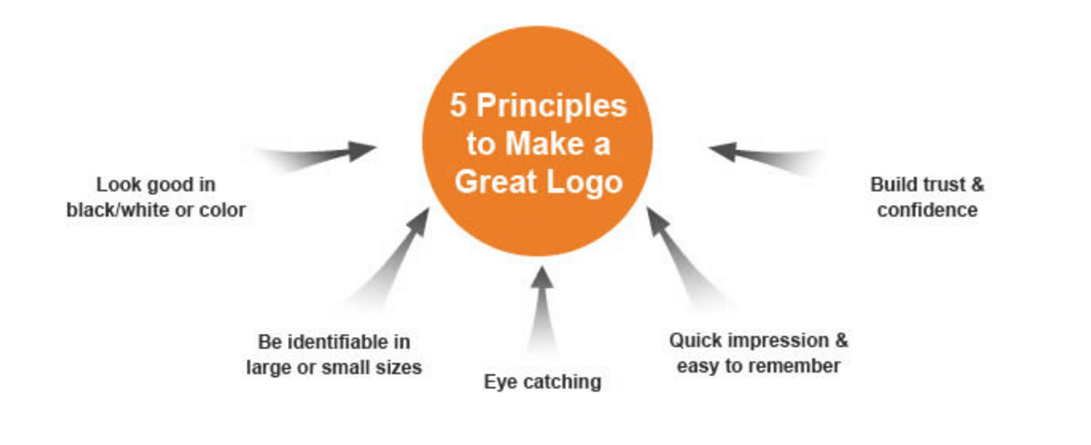
Thought I’d share this write-up entitled Anatomy of a Logo: Elements That Make a Logo Great. Here are some article highlights:
1. Visual element: This section’s title would benefit more from being called, “Presentation.” You want to have a consistent and comprehensive presentation that is easy for the consumer to digest and to remember.
2. Color: Do market research relative to your company and see what color templates move the most units. Profit from the Research & Development of others.
3. Font: This section makes the distinction of business versus casual. What type of company are you?
4. Breathing Space: Referring to space that is left blank surrounding and within a logo. This effect creates a vacuum and allows for your logo to pop out. Very effective technique for magazine or comic book covers.
Image Source: Logo.


