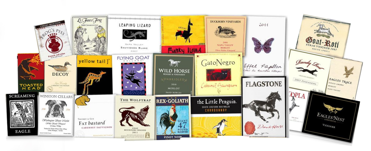
You know what type of wine moves the most volume? The bottles that have an animal logos on it. The reason why isn’t too difficult to deduce: people like animals.
Throughout the course of the human experience, we become conditioned to certain customs. For example, you meet someone, you shake their hand and you say hello. You obey traffic laws, and you get so ornery when other do not follow suit. You walk into a restaurant, you look for either a hostess or a sign that says, “Please seat yourselves.”
In like manner, the value in a consumer being able to process a situation is tremendously advantageous to a business. Let’s go back to the example of wine:
When selecting a wine bottle, one can be surrounded by as many as hundreds of different brands, types, and so on. Sure, there is some clerk there who went to “wine school” to assist us with something as simple as “that tastes good.” But, really, so much is contingent upon what is on that label. Personally, I always go with the one that has a penguin on it. Why? You guessed it. I have a spot in my heart for penguins. If there were a puppy or a bear cub on a different label, then I may break rank.
So when it comes to branding your business, and when it comes to designing your logo, go with something that people can process.
It’s like speed dating for consumerism.
Image Source: Wine.


