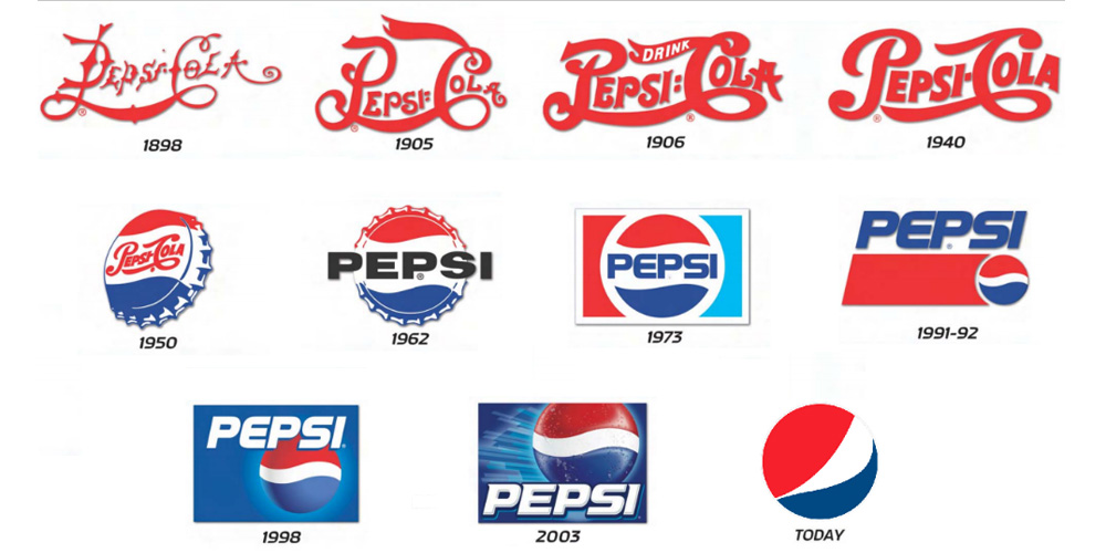
Thanks to Geek Fill for juxtaposing these past and present logos. Minimalism is making it’s go-round again. And thank goodness. I could use some single entendres after years of double entendres. How about just hip fatigue? The shift towards a straight-forward approach to design means that perhaps companies are picking up on how much people are turned off by outbound marketing.
Look at the old Pepsi logo: It’s crashing through a glass ceiling, and not in a civil rights way, and it’s coming straight at us. Now look at the new, laid back Pepsi logo: nothing projects aloofness like a circle against a solid background. This is the logo equivalent of “whatever”; and “whatever” is huge right now. Businesses are now presented with the challenge of existing to make a profit without coming across that way. New consumer posturing calls for new business etiquette.
Why, though, would Cartoon Network change their logo? Where is the imperative? From my limited experience with the station, I have discerned this much: Cartoon Network used to be a network primarily for children; now the station carries just as much content for older demographics. Know what that means? That’s right: lose the kiddy logo.
Journalists, marketers, humans: there is a compulsion to replicate success. Such behavior is how the public begins to crave other aesthetics, other mannerisms, other experiences (or older experiences rehashed). In general, though, it’s like a flock of birds perched upon a branch: once one bird leaves for different real estate, the rest follow suit.
Image Source: Flat Logos.


