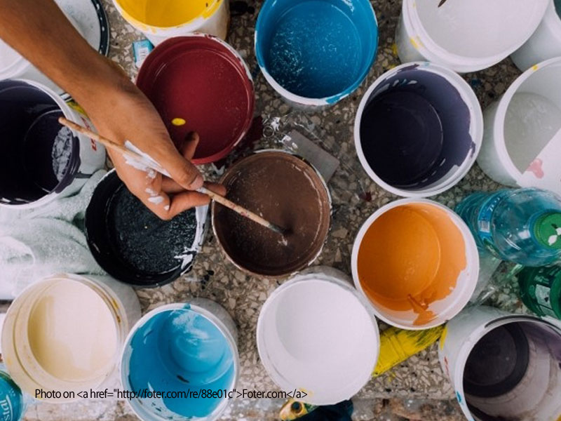
Color is a surprisingly peculiar thing. It affects the way we judge different items and the feelings that we have when viewing them.
Color has a huge effect on branding, by creating moods and feelings that influence us. It can be your vital piece when setting your marketing’s tone and how your audience and market accepts your message.
Frustrated about color? Even though you can make many generalities with-in the realm of colors’ effects on psychology, everyone sees colors in different ways. As a result, everyone has their own variation and preferences to certain colors.
But no matter your choice in color scheme, consistency is vital. Try and stay as uniform as much as possible when it comes to brand recognition for your corporate identity. Trust is built with consistency.

You can Identify this famous red & gold from miles away.
So What Color is What?!
The first step to trying to gauge or communicate anything is some type of ‘scale’. A way to convey the different values that you deal with in a realm. For colors in the graphics industry, this gauge is PMS colors, or the Pantone Matching System.
This internationally accepted system for color matching is a library of ink formulations that are created as a standard. It would be used if you were choosing your companies corporate colors.
A Pantone color swatch book is a commonplace instrument in every print designers tool belt. The reason being that the way certain colors react on paper, when properly printed, can be vastly different from what you are viewing on your monitor.
Consistency Doesn’t Come Easy
Staying consistent with a particular color is extremely difficult, if not close to impossible. These unfortunate fluctuations can be due to the wide variety of reproduction processes or a wide variety of other reasons.
You can only think of getting colors perfect as a goal to shoot for. Compromise in this area is a must — that is unless you don’t mind spending a small fortune in printing costs. As an alternative, you can choose a pms color which will give you the closest match possible, depending on the medium that you’re using it for.
Having said that though, I’ve actually compared PMS books to each other and seen variations. The colors can change in any given book due to age or even print runs.
It Just Gets More Complicated
If you have full color photos or graphics you’ll have to use full color presses. These use percentages of cyan, magenta, yellow and black inks (CMYK) to create the photos and graphics. Your PMS colors will still need to be created out of these four process colors.When that happens, the pms color that you’ve created with the process colors will be close but never exact. The solution here would be to print your job in five colors. The four colors of CMYK plus your individual PMS color. The four-color process for the majority of the job and your spot PMS color for, say, your brand or logo.
Now, if you’re going from print to web or digital, it gets even more complicated. Utilizing your graphics for a website, PowerPoint, or anything else that will be viewed on an electronic medium uses a whole different color system!
Your color for digital pieces will be created out of a color system consisting of 3 colors: Red, Green, and Blue or RGB. This is due to the way monitors display and trick your mind into seeing colors. (If you want to see an awesome video about it, check this out)
Each one of these processes give a different result. And if you can believe it, you can complicate things even more.
If you’re printing you can choose coated stock or uncoated stock. Or you can differentiate the actual color of the paper, which will alter the color as well.
So…What do I do?
With electronic mediums like laptops, ipads, smart phones or TV’s are used you will almost always see a difference when you’re looking from monitor to monitor. Ready to give up? As I mentioned earlier you have to shoot for it as a goal. You can always come very close but the expense for printing five colors is always a consideration. If you have a two color logo even more of a consideration.
In the end, it goes back the importance of a quality designer. A designer who will help you think about these specifics before they become a problem. That way you can develop a professional and flexible logo design and branding.
Let US become that designer that makes you and your business look good!
Do you need a website, Logo, or marketing piece designed? Come on by for a cup of coffee and lets discuss you, your organization, and your product or service.


