Subscribe to Our Newsletter!

We’ll have fetch bring you our newsletter filled with Business tips, freebies, and articles right to your inbox!

Challenge

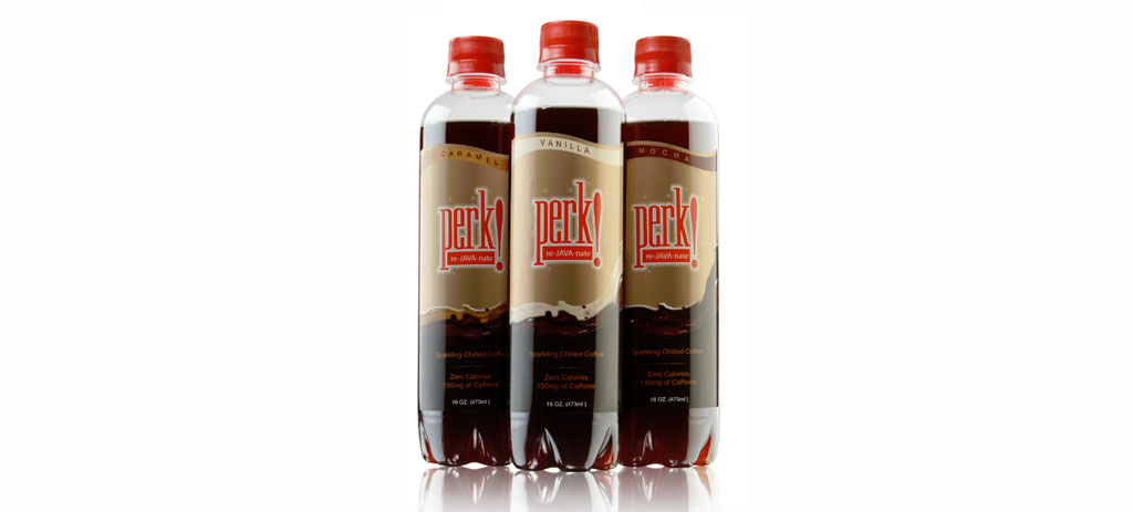
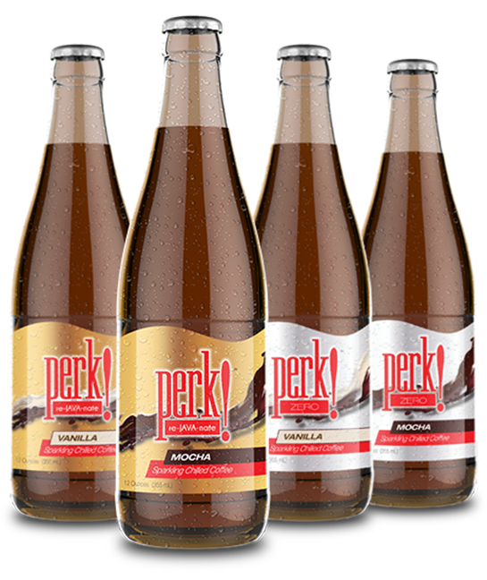
To develop an attractive brand, labels and packaging for a new line-up of Sparkling Chilled Caffeinated Coffee Drinks to be sold in higher-end Grocery Stores. The product line-up included two flavors, mocha and vanilla in both sweetened and sugar free varieties.

Solution

Our solution was to offer a high-end looking package geared towards an adult market. Further appealing to an older demographic with several alcohol recipe being offered on the website and other marketing materials – encouraging it’s use as a cocktail mixer.

Result

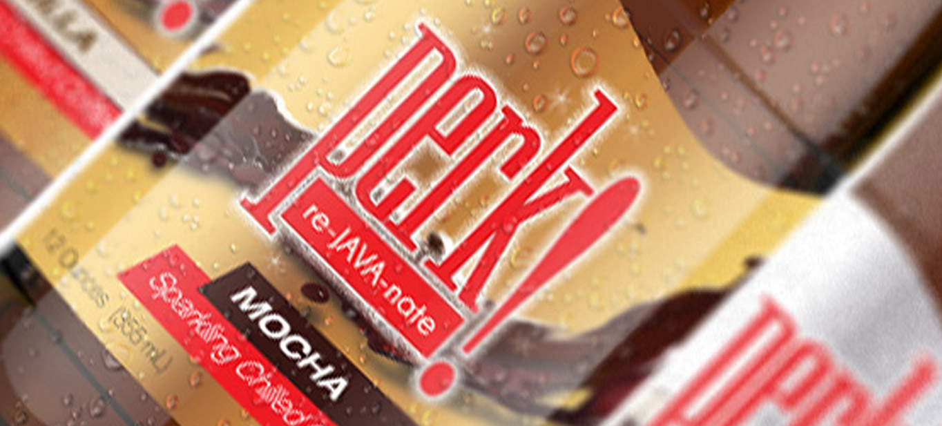
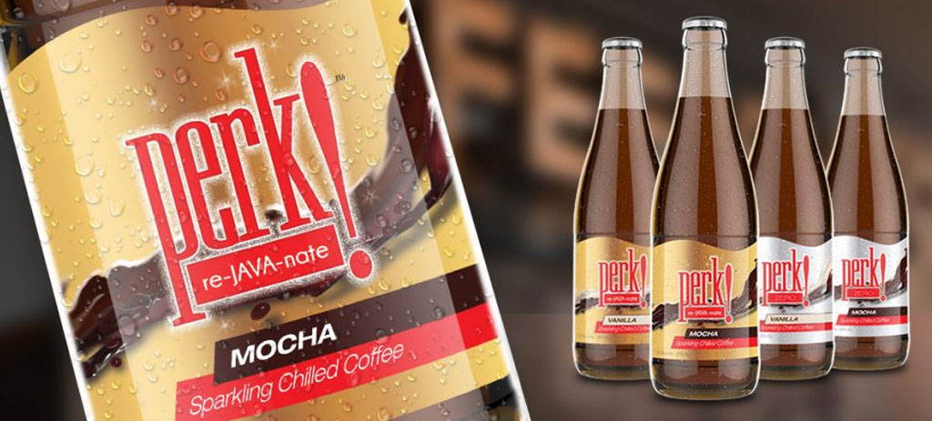
To hit the high-end look, we used a foil label with six color printing and a glass bottle. The label was die cut with a wave at the top just to create a unique look without adding much to the cost. The actual bottle was simply a stock item, keeping costs down for the customer.

If you’re a coffee freak like me you’ll love it. It comes loaded with the same amount of caffeine as two cups of coffee. Also included in the line up is a No Sugar version called PERK! ZERO, with the same great flavors.

Project Challenges

Coffee is a very popular drink around the world. It is often used as an after dinner drink mixed with alcohol. Perk offers a sparkling caffeinated beverage that can be consumed by itself or used as a mixer for many different alcoholic beverages.

Project Solutions

To create a unique package design for a New Sparkling Caffeinated Product. Perk was designed to be offered to young adults as both a softdrink and a possible mixer for cocktails. The product is set to launch in the North East as a test this summer.

The Process

We created the label, packaging and carton design for the product line up. We produced mock ups and finished art for the product line up.

Investigation

Generally we start with an examination of your direct competition as well as similar brands in your space – often involving something as simple as a trip to the grocery store. Might sound a little strange but you have to see what your up against with your competition. Based on your goals and targeted customers, we come up with a strategy for the look, feel and direction of the product.

Branding

Now that our research is done we start with the Product Brand. In this case it was done in conjunction with the label designs since we were starting from scratch on the whole project. Several variations were offered to the client.

Label Design

Once we all agree on the design the full line-up is executed and mocked up. See an example to the left.

Execution

Now that all is approved we finalized the front labels with various copy revisions and prepared the back labels for final presentation to the client. Once all is approved the files are uploaded to the printer for proofs.