Your packaging says a lot about your product and what your business has to offer.
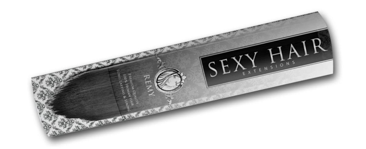
Your package is literally a business in a box. It can either lure you into buying the product or go completely unnoticed. We worked with DS Supply to develop a package for their remy hair extensions. Remy just means all the cuticles of the hair face the same way in order to make it more manageable and real looking.
They wanted to use a box that resembled a champagne bottle to associate the business with elegance. I think the packaging came out really nicely and captures the theme we were looking for. Now, I’m not fully educated in the hair extension field, but I’d say the design and overall display of the package and product looks pretty darn regal. There is also a window in the box to show the color and quality of the hair, which is important to include. If the customer can’t physically see the product, they may not be willing to take a risk and purchase it.
The main thing to take away from this, is if you need to create a design for your packaging, there are many things to consider. Decide what message you want your business to convey to the public and then display that in your packaging. It’s always fun getting ideas while browsing products in the store, just make sure your idea is better of course.
Visit DS Supply’s website here.


