Google’s Good Design is Gradually Going Great! Darn…Couldn’t realistically fit anymore G words in that subtitle. But read that line again,”Google’s Good Design is Gradually Going Great”. Focus on that feeling that it gives you. It’s that feeling that something is just … not ‘proper’ about it. Something is just not right.
It’s a good contrast to great design. Just making things right. (That’s right, I’m admitting that my subtitle is poorly designed.)
Good design, in many respects, are those subtle changes and differences in a piece or interface that make the thing just right. Creating this ‘Goldy Lochs’ area where the user experience is just optimum for the medium, atmosphere, and nature of the item that you’re interacting with.
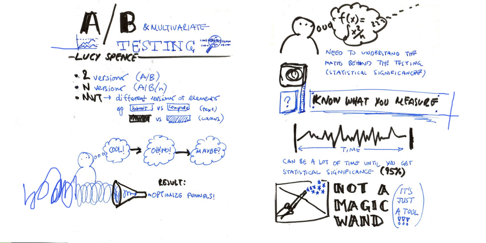
A certain method that has become a wonderful way to land in this ‘Goldilocks’ zone is A/B testing. Recently gaining traction because of its availability in our new technological jungle of techniques. A,B Testing allows designers and marketers to optimize their campaigns and designs to most effectively influence their target audiences.
A/B testing is a simple way to test changes to an online medium and determine which ones produce positive results. It is a method to confirm that any new design or change to an element on your piece is improving your conversion rate before you make that change across the board. Effectively measuring the impact of the piece.
“At its core, A/B testing is exactly what it sounds like: you have two versions of an element (A and B) and a metric that defines success. To determine which version is better, you subject both versions to experimentation simultaneously. In the end, you measure which version was more successful and select that version for real-world use.” -Paras Chopra, Smashing Magazine
And who’s a well-known and wildly successful proponent of A/B Testing? Google!
Many of their online properties, from Youtube to Gmail, have been optimized and perfected to their target audience. Google’s most recent change is the new Card-Based “Unified Design” Search Results For Mobile Devices.
Why make any changes to Google’s classic layout specifically for mobile? According to findings in the 2013 Mobile Path-to-Purchase study by Telmetrics and xAd, 46% of Searchers Now Use Mobile Exclusively to Research. Whether it’s to find the nearest pizza joint or who the 46th President was, a large section of internet users almost solely explore the inter-webs with their mobile devices.
So if that large of a chunk of your user-base is utilizing a whole different platform, why wouldn’t you look to make their experience better?

The ‘cards’ that the search results are displayed with-in assist users in navigating the interface by eye.
Google said A new “more unified design” will offer “cleaner and simpler, optimized for touch, with results clustered on cards so you can focus on the answers you’re looking for.”
Which I agree, the design better assists a user navigate the general busyness that a page of search results can become. Especially considering that a mobile device is a smaller viewing area many times viewed during times of movement or in times of divided attention.
You can see it in action in the video above.
What do you think about the design?
(via SearchEngineLand and SearchEngineWatch, Images thanks to @perlerar and Smashing Magazine)


