I don’t really want to get biblical so let’s just say that I’ve been doing packaging for a long time. And the one thing that has been reconfirmed for me more than anything else through countless product launches is that the packaging of your product will be a critical element of your products success.
As the first thing that your potential customer interacts with, your package design is the face of your product and, more often than not, the factor that will get or lose you the sale.
What is it that makes a package design successful? Luckily, certain principles of package design – what works and doesn’t – has maintained for decades and will continue to stay true. We call these the 10 Commandments of Effective Package Design!
- Thou shalt not Overwhelm Your Package Design.
Skip to Section → - Thou shalt have a Value Proposition.
Skip to Section → - Thou shalt get Creative.
Skip to Section → - Thou shalt Tell Your Story.
Skip to Section → - Thou shalt Look to Build Trust.
Skip to Section → - Thou shalt Reinforce Your Brand.
Skip to Section → - Thou shalt not Ship Air.
Skip to Section → - Thou shalt Encourage Customers to Spread the Word.
Skip to Section → - Thou shalt have all Necessary Information on your Package.
Skip to Section → - Thou shalt not Limit Your Product’s Marketing Potential.
Skip to Section →
Commandment One
Thou shalt not Overwhelm and Say too much on the Front of your Package Design
A picture is worth a thousand words. Graphics can add another thousand. Your box will be viewed initially from three different distances. Your first goal is for someone to see it from a distance. You’re next goal will be to bring them in closer where they can start reading the rest of your box. Your last and ultimate goal is to have them pick it up to read further details, drawing them into your product to ultimately make the sale.
But how do I make my Product stand-out?
There are many factors involved to achieve this, but the best starting points to give you a solid direction to get going are:
- What is your competition doing? (Marketing, Package Design, Product specifics, etc.)
- Who is your target market? (What they like, what matters to them, what their aesthetic is, etc.)
- Where will your potential customer first interact with your product? (Store Shelf? On an end-cap? Right next to the checkout line? On the internet?)
These are the questions that will give you an idea as to what type of imagery that you should use, what color schemes are effective, ideas as to what type of packaging that you should use to encase your product and more.
More often than not, trying to fit every possible benefit of the product on the front of the package will junk-up your presentation and over-complicate the layout. Look to show your benefits instead of tell your benefits.
Commandment Two
Thou shalt have a Solid Unique Value Proposition
Don’t make them wonder what it does, be short, sweet and to the point. Too much copy will actually prevent someone from reading it. If they wanted to read a book, they would have stayed at home to do it.
Try to keep it limited to three bullet points and make those bullet points announce the three best things about the product. Then list the additional selling points on the rest of the package. You want the potential customer to understand your product’s value proposition. The primary reason(s) that the prospective customer should buy your product. A solid value proposition is a clear statement that covers the following:
- Explains how your product solves customers’ problems or improves their situation – how it’s relevant to them,
- What specific benefits the product provides – quantified value,
- Clarifies and illustrates the ideal customer and why they should buy from you and not from your competition – unique differentiation.
Your value proposition is the thing that should be as clear as day on your package design and any other auxiliary marketing pieces. Past these prime pieces of your product’s value, you have other opportunities to further convince a possible customer of your product’s worth.
Keep in mind that, while the real estate that you’re working with is limited, creative layouts and designs often can provide much more space than you’d imagine. Also, be aware, that you can give an infinite amount of additional information to a customer by simply providing a web address to a polished website.
Commandment Three
Thou shalt get Creative with your Package Design.
We regularly see that many marketing goals and product challenges can be overcome with some package design creativity. Do you want to raise the perceived value of your product or brand? Do you not have enough space for information that a potential customer needs before a purchase? Do you want to provide more value to your customers? Do you have security, ecological, deterioration or shipping concerns with your products?
With designers experienced with what is possible and some brainstorming, we’ve seen many instances of issues like these being overcome. You can see examples of these situations above.
Elevating the Product
The first example above is a rum bottle that we designed. They knew what type of bottle that they wanted to use but wanted to do something more than a standard label. After developing the brand, we worked with them to develop a beautiful label with an eye-catching die-cut that is physically printed right onto the bottle. The striking package helps them standout on the shelf and elevates its perceived value. You can read more about the process behind the design and development of the Guazapa brand and bottle here.
Not Enough Package Real Estate?
The next two designs above had more information than they could comfortably fit on their respective packages. The first of the two, we created an open-able flap that provided more space for information. Not only does this provide more room, it makes a potential customer curious and gives them something to interact with.
The second of the two was going to have a simple card within a clam-shell with the product and attempt to get all the information on it. Instead, we worked together to develop what is essentially a brochure that they can package in a clam-shell or even use just as informational for trade-shows and other events.
Interactivity
The fourth package design in the gallery is a toy car that makes sounds. In order to show how it works, the box is open and allows a potential customer to interact with it and see what it does. This is especially good when the end-user is a child. They are much less likely to read features and would rather experiment and see what it does.
Security Concerns
Back to the third package design in the gallery, they had concerns with security and transport. So we assisted them with getting the package encased in something nigh-indestructible: a plastic clam-shell. They help avoid in-store theft and keep out any moisture as well as keeping the product safe during transport.
Help the Product Standout
The last two in the gallery above have unique aspects to the packaging that really help the package standout from everything else in the aisle. The first of the two being a skin tanner and the second of the two a book-light.
Do you have a packaging problem that needs some out of the box thinking? Give us a call at 954-680-4584 and we can help out.
Commandment Four
Thou shalt Tell Your Products “Story”
By now you’ve brought the customer in for a closer look and have encouraged them to pick it up and read more about it. Now is your big chance to make the sale!
The most effective way to do that is to Tell your products “Story”.
Tell them how well the product works, how useful the product is and make sure you list all of the product’s benefits – but most importantly – help your customer imagine how great it will be to own and use your product.
Through imagery and descriptive text, give the prospective customer an idea as to how, when and where to use your product and how great it’ll be!
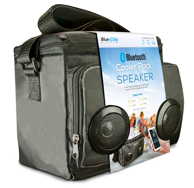
In the example above, not only do we list that the cooler is great for the beach, picnics and more, but we show a visual of how great a time you can have with friends and family if you bought this speaker.
This goes back to the idea of show, don’t tell. Many big brands do this very well in their marketing and you can use them for inspiration. With Bud Light, you’ll have a great time with your friends. With Nike, you’ll be faster. With Coca-Cola, life will be swell. They all use this indirect imagery so that you associate these ideas with the brand and you also feel better when using their products in those situations.
Commandment Five
Thou shalt Look to Build Trust
Another element that you can add to your package design in order to facilitate a sale is nurturing trust and ensuring to a prospective client that your claims are backed by something.
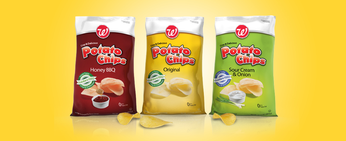
This includes things like customer testimonials or guarantees of quality like on the chip bags that we designed above. Adding some type of money back guarantee or warranty as a reassurance that they will be 100% satisfied with your product. Statistically, it’s unlikely that customers will look for a refund if the product is under $50.
Another great trust builder are any awards or positive publicity that the product has. Take advantage of any awards or recognition that your product has won.
Other forms of potential benefits that can be used to build a potential customers trust are things that your target customer may care about. This includes things like if your product does not contain GMOs, is organic, uses renewable packaging, etc. It’s important to ask and figure out who your potential customer is and have an understanding as to what matters to them.
Commandment Six
Thou shalt Reinforce Your Product Brand and Product Line
An element that should be considered to be added to your package design is the promotion of your brand and product line. Do you have other related products to this one? Show what they are, the difference between the current product and the other item in the product line and give them an idea where they can purchase it.
The other piece is promoting your brand. Can you provide a relevant call to action to the customer to improve their experience with the product? Call to action items include things like recipes that the customer can follow to better use your product, an idea as to where they can go online to learn more uses of the product or any extraneous activity that the customer can do that allows them to further interact with the brand in a positive way.
Here are some unique ways certain companies have allowed for further interaction with their brand – often becoming industry standard:
- Cereal brands adding puzzles and games to their boxes.
- Snapple with their Snapple facts on their drink lids.
- Cracker Jacks with the small toys included in the bag.
- Recipes on countless food product packages – improving customer experience.
- Coca Cola and other companies with their under-the-cap promotions.
Do you have any other good examples of companies getting customers to further interact with their brand on their packaging? Share them in the comments below!
Commandment Seven
Thou shalt not Ship Air – Unless You Need to
When considering the shape, size and die-line of your package design, always take into account the possible effects of shipping!
A die-line is used in package design as a placeholder for assisting in the proper layout of a document that will be die-cut as part of the finishing process. It is usually placed into the graphic’s computer file as a separate layer for sizing and orientation purposes. It is necessary to insure the right size, shape and dimensions of a package design for a product. If you need assistance with your die-line, give us a call at 954-680-4584 – we can help!
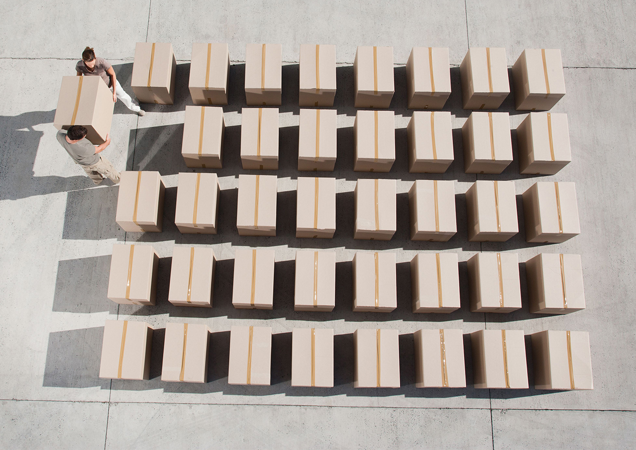
Often, it’s best to avoid excess air within your package or when your products are placed together, side-by-side. Every inch of excess air when shipping is an inch of empty space that you’re paying to ship. This is why boxes and cubes are such a popular choice to contain products. If they’re the right dimensions, excess space is very limited.
While avoiding excess space is often preferable, there are instances where extra space is the target. If your product gets picked up by a big box retailer, it is very possible, depending on what is negotiated between you and your buyer, that you must fit a certain amount of product on a pallet.
If your current package design fits 100 products on a pallet but they have negotiated for 50 products per pallet, you must make it fit! This would involve working with your package designer to make more space and engineer a package that will fit based on these new guidelines.
Another possibility is if you have negotiated for a display or end-cap, your product must now properly fit within the boundaries of this new domain. This may require an increase or decrease in size of your package design in order to fit your display.
An end-cap, or end-cap display, is a product setup positioned at the end or beginning of an aisle that a customer will see before entering the aisle. It is often a very sought after position for products as it’s much more visible to potential customers. An additional display is often included in these setups. Whether this display is a banner, a shelf setup or a stand-alone presentation. If you need assistance with your end-cap display, give us a call at 954-680-4584 – we can help!
The last reason that you may need to “ship air” would be if you had security concerns. Smaller electronic products, as an example, often have much larger packages than necessary because it is much more difficult to steal the product.
While there are a lot of factors regarding the size of your product’s package, it is definitely a concern to keep in the back of your mind while progressing through the process.
Commandment Eight
Thou shalt Encourage Customers to Spread the Word
So you’ve got them to buy and hopefully they’ll love your product. A package is a great way to deliver incentives to share and spread the good word about your products. First and foremost, ask them to go go to your website, or other website you’re looking to bolster with positive review, and leave a positive testimonial. Or ask them, if they did run into a problem, to send you a message and let you know how you can help them solve their predicament.
There are also many different types of sales promotions that you can use through social media and other platforms in order to boost knowledge of your product.
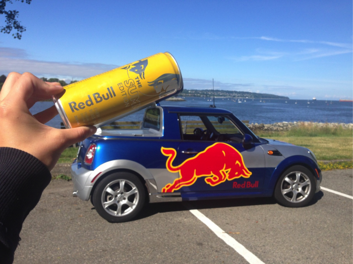
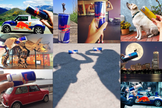
These includes things like Coca Cola’s instant win under-the-cap promotions – but they don’t need to be so complex. You can make it as straight forward as Red Bull’s #PutACanOnIt campaign.
Though Red Bull had created the hashtag, Red Bull was inspired by a photo that the company had found on Twitter wherein the photographer is seen holding a Red Bull can above a Mini Cooper to make it look as though it was the classic trademarked Red Bull car with the giant can on top.
The trend exploded as people around the world started creating their own images with Red Bull cans placed in unique positions.
There were thousands of photos shared of a simple Red Bull can.
You can take a look at some of the images in the neighboring image to see some of the fun, creative, and unique ways fans #PutACanOnIt.
This is a simple example as to how for the cost of some creativity, a company can gain a lot of publicity. It’s always worth an attempt considering that you never know what will land in the cultural consciousness at the right time and connect with your target audience.
Commandment Nine
Thou shalt have all the Necessary Information on your Package
During the process of developing the package design, be sure to double and triple check that you have every piece of information that you are required to have based on the type of product that you’re selling. Depending on the type of product, here are a few items to consider that you should have on your package:
- Bar Codes.
- Directions / Instructions.
- Copyrights / Trademarks.
- Contact Information.
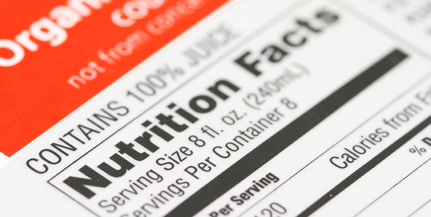
- Nutritional Information / Ingredients.
- Relevant Government Required Information.
- Relevant Warnings.
- Product size and weight information.
- Product Origin Location (City/State/Country).
- Relevant Seals and Qualifiers (Kosher, Organic, etc.)
- Any Store Requirements.
It’s best to put together a list of items that you need to ensure are required on your design and provide a copy of that to your package designers.
Commandment Ten
Thou shalt not Limit Your Product’s Marketing Potential
Last, but certainly not least, is that you shouldn’t limit the potential for your company to have an invaluable tool online: a website. Your website can easily become a priceless tool for you and your business, providing marketing opportunities and more:
- You can provide more information, instructions or directions for customers.
- You can provide the latest updates about your company. This includes things like new upcoming product launches and more. Giving customers that love your products something to look out for and they can feel closer to you and your brand.
- And you can even sell your item yourself on your website as well as track inventory and customers for many different types of future marketing uses.
Your box has limitations but a website can contain an endless amount of content and grow with you and your business for whatever comes down the line.
Even if you don’t currently have a website, be sure that you grab your domain so someone else doesn’t take it before you. You can learn more about purchasing domains here.
Follow these 10 Commandments of Effective Package Design, be fruitful and prosper!


